I didn't want another app policing me, another timer to swipe past, another lecture from my own phone. So I tried the one intervention that asks nothing of my willpower in the moment: I drained every drop of colour out of the screen and left it that way for a month. Here's the honest, un-preachy account of what greyscale did to my screen time — and, more interestingly, what it didn't.
The theory is seductive and it's been floating around for years: our phones are engineered to be beautiful little slot machines, and colour is a big part of the payout. The red notification badge, the saturated thumbnails, the way a feed glows at you — take the colour away and you supposedly take away the pull. I'd read that a dozen times and never actually done it. This month I finally did, properly, for thirty days, and I logged my screen-time numbers each week instead of trusting my memory. What follows is what the black-and-white phone was genuinely like to live with.
Why I even tried this
My screen time wasn't catastrophic, but it was quietly embarrassing. A little over three hours a day, and — worse than the total — around ninety pickups. Ninety times a day I was reaching for a glass rectangle, often without deciding to. Most of those weren't real tasks; they were the fidget of a spare three seconds in a lift, a queue, a kettle boiling. I've written before about how much focus I clawed back when I stopped fighting my own second monitor, and this was the same instinct pointed at the device I actually carry everywhere. Less surface for my attention to leak out of.
I deliberately picked greyscale — or grayscale, if you spell it the American way — over the more aggressive options because it's the least confrontational. App blockers and timers pick a fight with you at the exact moment you're weakest — the moment you want the thing. Greyscale doesn't fight at all. It just makes the reward smaller before the craving even starts, which felt far more sustainable than another wall to climb over.
The first week was genuinely horrible
I'll be honest: I nearly quit on day three. Not because anything broke, but because a greyscale phone is unpleasant in a way that's hard to describe until you've lived it. Everything looks slightly ill. Food photos look like something off a hospital menu. Your carefully chosen wallpaper becomes a grey smear. The phone stops feeling like a treat and starts feeling like a tool you have to use, which — of course — is exactly the point, but knowing that doesn't make the first few days less grim.
The interesting part was watching my own hand. I'd pick the phone up, the grey slab would light up, and about a third of the time I'd just... put it back down. There was nothing to see. No hit. The muscle memory was still firing — reach, unlock, open something — but the something wasn't rewarding, and the loop fizzled out halfway. That, right there, is the whole mechanism. It doesn't stop you doing anything. It just quietly deflates the impulse.
What the numbers actually said
By the end of week one my daily average had dropped from a bit over three hours to around two hours forty. By week four it had settled at roughly two hours twenty — call it a 25% cut, which honestly surprised me, because I'd braced myself for the "no measurable difference" result that a lot of these tricks deliver. But the total minutes weren't even the headline. The pickups were. Ninety a day fell to somewhere in the fifties. The mindless grabs — the ones with no purpose — were the ones that evaporated, while the deliberate uses (messages, maps, actually reading something) stayed roughly the same. That's the pattern I cared about: it trimmed the junk and left the useful bits alone.
"Greyscale didn't make me use my phone less by force. It made the phone less interesting, and then I used it less on my own — which is a completely different, far stickier kind of change."
What greyscale fixed — and what it didn't
What it fixed: the reflex. Standing in a queue, I'd reach for the phone, get nothing back, and actually look up at the world instead. Evenings improved noticeably; the sofa-scroll that used to swallow an hour lost its grip because the feed simply wasn't shiny enough to hold me. Sleep felt a touch better too, though I won't overclaim there — I was also being stricter about screens before bed, so I can't hand all the credit to greyscale.
What it didn't fix: intent. On the days I genuinely wanted to waste time, I wasted it just fine in black and white. Greyscale lowers the ambient temptation; it does nothing about a determined craving. If you sit down specifically to scroll, you'll scroll — grey pixels and all. It's a tool for reducing the accidental use, not the deliberate kind. Anyone selling it as a total cure is overselling it.
It also actively got in the way for a few things. Editing photos was impossible without flicking colour back. Maps lean on colour for lanes and warnings. And a surprising number of apps use a single colour cue — a red dot, a green tick — that becomes invisible in monochrome. None of that sank the experiment, but it did teach me the setting needs an escape hatch to be liveable.
The tweaks that made it liveable
The single change that made the whole thing work was binding greyscale to the accessibility shortcut — a triple-click of the side button — so I could summon colour back in a second when I genuinely needed it (a photo, a map, a video worth actually seeing) and then kill it again. Without that, I'd have given up. With it, greyscale became the default rather than a prison, and defaults are where the real behaviour change lives.
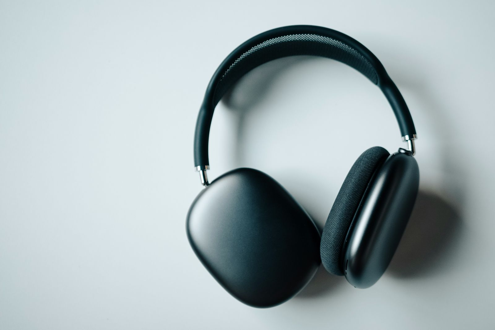
I paired it with a couple of things I'd already learned elsewhere. I kept the two apps I truly can't self-police behind a hard time limit, because greyscale alone wasn't enough for those specific dragons — the ambient nudge handles casual use, but a real habit needs a real fence. Getting that limit to actually hold took longer than it should have, and it's the whole subject of the screen-time setting I'd been getting wrong for years. And I leaned harder on genuinely single-purpose devices for the things that don't need a phone at all; the same logic that made me love reading on a distraction-free e-ink tablet applies here — the less a device can do, the less it can steal from you. When I want to actually concentrate, greyscale phone plus a pair of noise-cancelling headphones is a genuinely potent little focus stack.
The honest verdict: Greyscale is the highest-return, lowest-effort screen-time change I've tried — a roughly 25% cut and a big drop in mindless pickups, for the price of a settings toggle and a fortnight of your phone looking a bit sad. It won't save you from yourself if you're determined to scroll, and you'll want colour back for photos and maps. But as an ambient nudge that costs nothing and demands no willpower in the moment, nothing else I've tested comes close.
Would I keep it on?
Thirty days in, the answer is a qualified yes — and I'm still running it as I write this. Not because it's pleasant; it isn't. Because after the first miserable week I mostly stopped noticing the lack of colour, and what I noticed instead was picking the phone up less and looking up more. The unpleasantness is a feature, not a bug: the day greyscale starts to feel normal is the day it's doing its job. When I want the phone to be a treat again — on holiday, editing photos, watching something — the colour is one triple-click away. The rest of the time, my phone is a slightly boring grey tool, and my attention is measurably better for it.
If you want the next honest experiment before it goes live, join the Brite newsletter — no hype, just what actually earned a place in my week.
Greyscale made the phone less magnetic during the day; removing it from the bedroom did more for the evenings. And when I wanted to write without a screen at all, a month with an e ink tablet was the closest I got. Strip enough colour and novelty out of a handset and you notice something else too: the reasons to replace it thin out, which is roughly how I ended up keeping the same phone for four years — helped along by finally learning which phone battery habits actually matter and which are pure myth.
Stripping the colour out made the phone duller on purpose. Making it genuinely more useful was a separate project — turning it into an assistant worth reaching for — and the two pull in opposite directions more than I expected.
Questions people actually ask
Does setting your phone to greyscale actually reduce screen time?
In my case, yes — but modestly, and mostly through fewer pickups rather than a huge drop in total minutes. Over 30 days my daily average fell by a bit under a quarter, and the bigger change was that I stopped grabbing the phone for a two-second dopamine hit. Greyscale doesn't block anything; it just makes the phone boring enough that mindless scrolling loses its pull.
How do I turn my phone screen black and white?
On iPhone it's Settings → Accessibility → Display & Text Size → Colour Filters, then switch it on and choose Greyscale. On most Android phones it's under Digital Wellbeing or Accessibility as a greyscale or monochrome toggle. The real trick is to bind it to a shortcut — triple-clicking the side button on iPhone — so you can flick colour back on when you genuinely need it, then off again.
What are the downsides of a greyscale phone?
Photos look flat and unappealing, which makes editing or even choosing a picture genuinely harder, so you'll want colour back for that. Navigation apps lean on colour for lanes and alerts. And some app icons and buttons that rely on colour to signal status become harder to read. None are dealbreakers, but they're the moments you'll reach for the colour shortcut.
Is a greyscale phone better than app blockers or screen-time limits?
They solve different problems. App blockers and timers fight you at the moment of temptation, which invites you to tap through or disable them. Greyscale changes the environment instead — it lowers the reward before the craving starts, so there's nothing to fight. For me the combination worked best: greyscale as the ambient setting, with a couple of hard limits on the two apps I truly couldn't self-police.